
Retail Design for Monday Market™
Developing the retail space for Monday Market™ in the prime location on Melrose Avenue in Los Angeles was a noble feat. From concept to completion, this large scale project involved environment design, merchandise design, paper goods, design wraps, store exclusives, detailed in-store marketing collateral, project management with producers, and even set decoration. The sheer amount of work around the tight 4 month deadline felt insurmountable, but against all odds, proved possible.
Client Monday Market™
Production Design, Graphic Design, Project Management Andrew Gary
Cinematography Alex Martinez
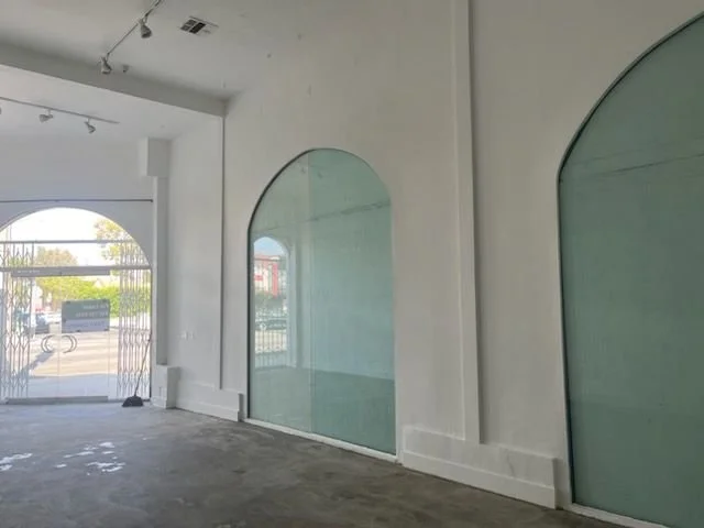

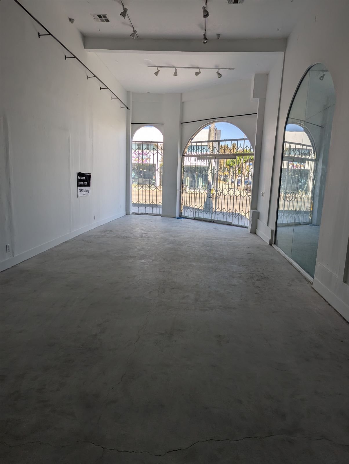
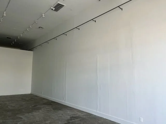

BEFORE
〰️
BEFORE 〰️
AFTER
〰️
AFTER 〰️
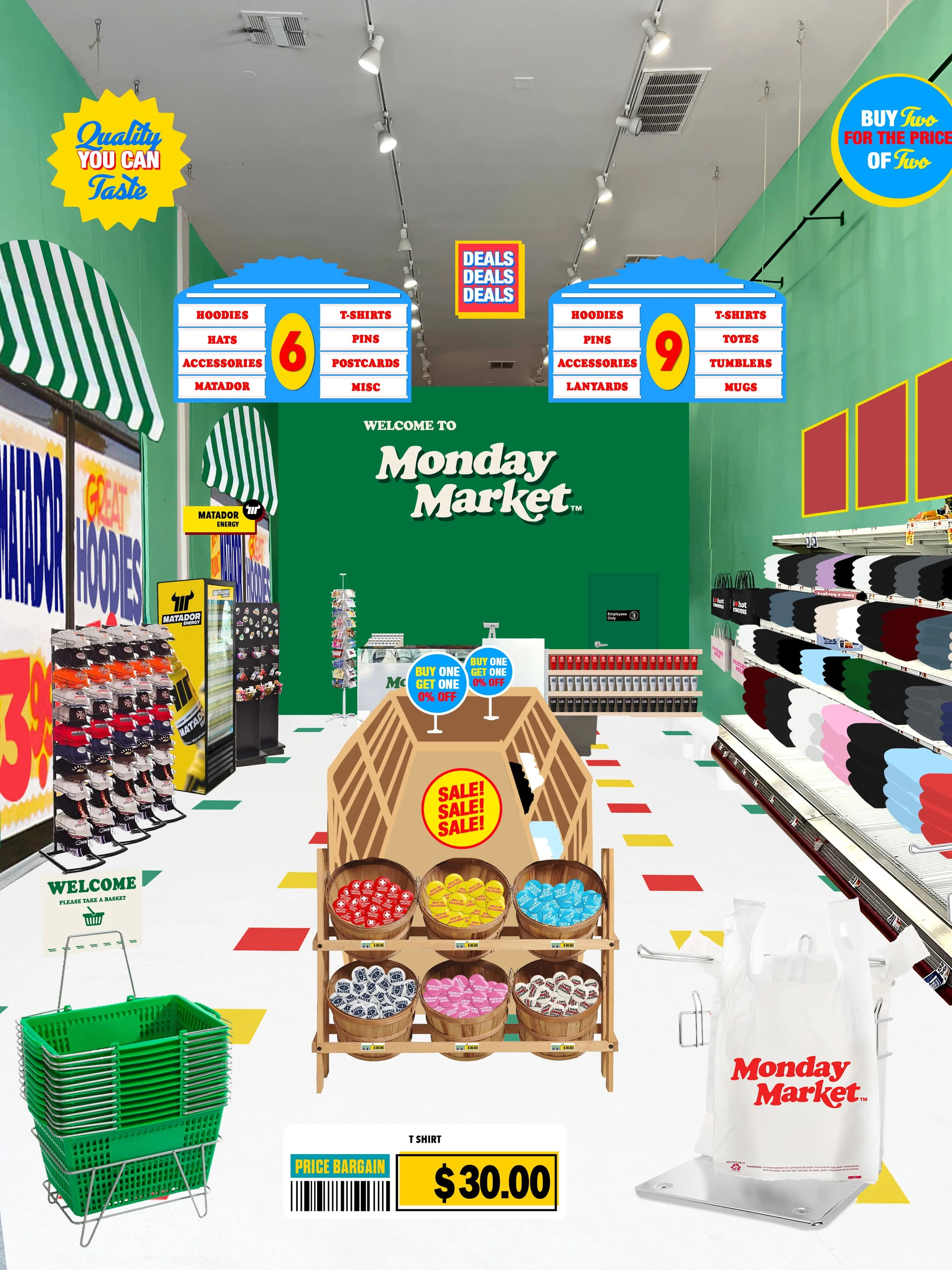
Full mock ups - designed in Photoshop.
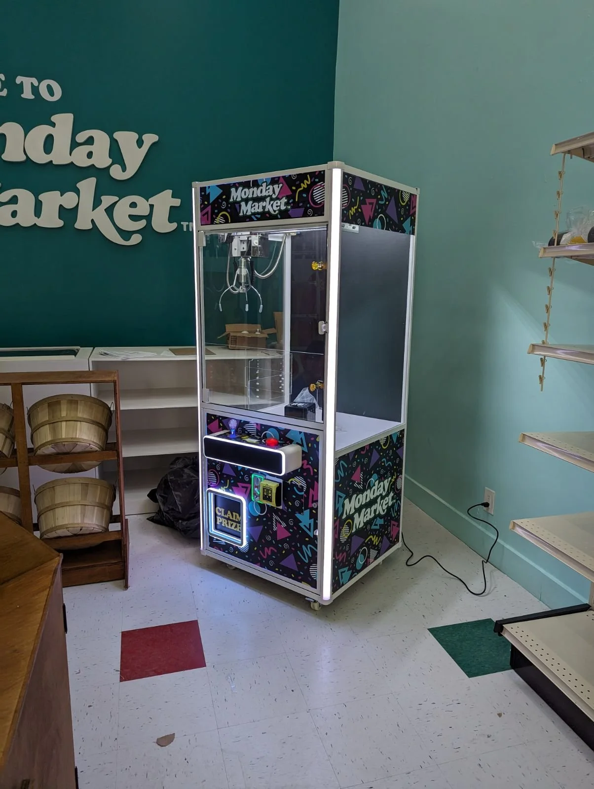
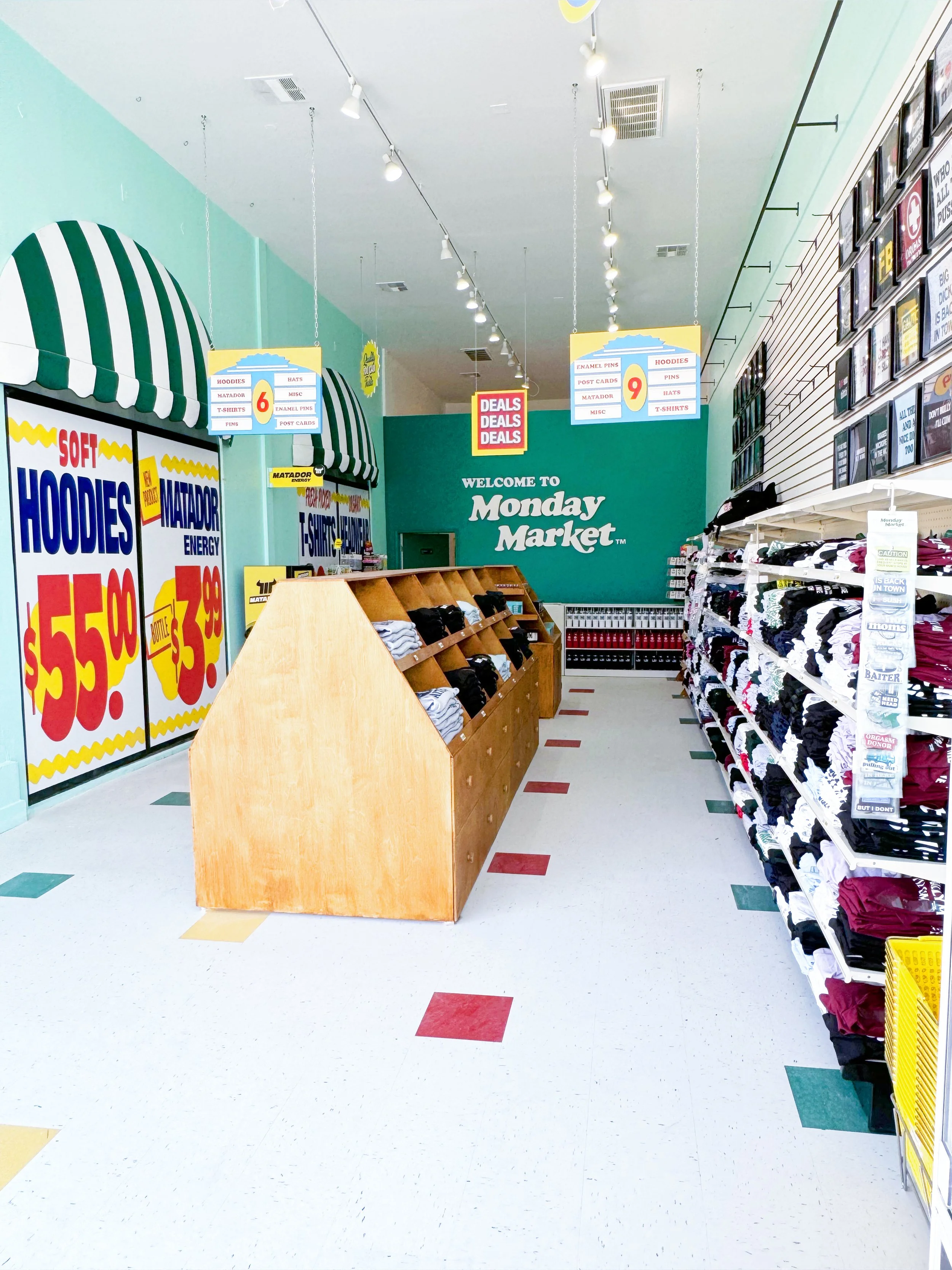
Included elements that you’d typically find in a corner store supermarket, complete with bodega shelving, fruit baskets, rotating postcard racks, enamel pin spinning racks, shopping baskets, refrigerated goods, claw machine, and much more.
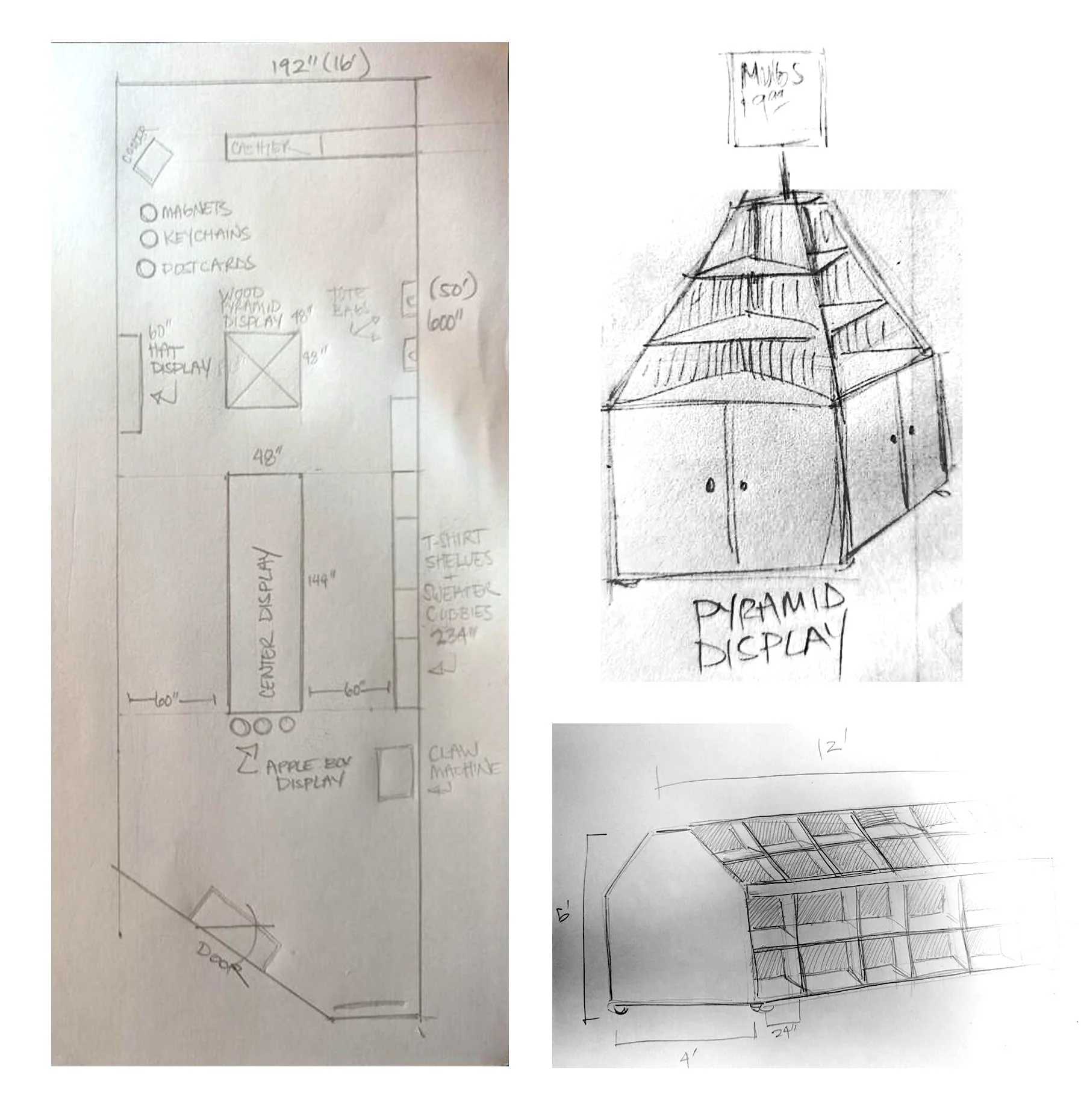
Scaled drawings of custom built wooden displays and layout for the retail space to optimize customer flow.
Retail store design was not on my bingo card. Although it provided a steep learning curve, I’m proud of the opportunity to create a unique corner market experience, stemming from the retail model of classic novelty shops in Venice, pairing with the streetwear apparel culture of Melrose.
Working with an LA based producer who has built sets for many notable brands, we frequently met on-site and helped create scaled drawings of my digital renderings. The layout of the store had an elongated rectangular shape and needed to flow for consumers, while utilizing every square foot of the space as a point of purchase. Ultimately, we landed on a bi-directional path that used merchandise itself as touchpoints.
There was a tight deadline of 4 months to complete the retail design, merchandise design including packaging, fabrication, building the space, and set decoration of over 200 SKUs. Nonetheless, we made it reality and the store was brought to life!
E-Commerce Meets Corner Store
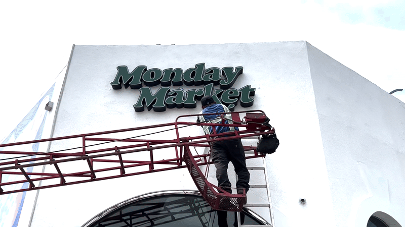
Overseeing installation of the 8 ft. fabricated acrylic storefront sign, illuminated at night with LEDs.
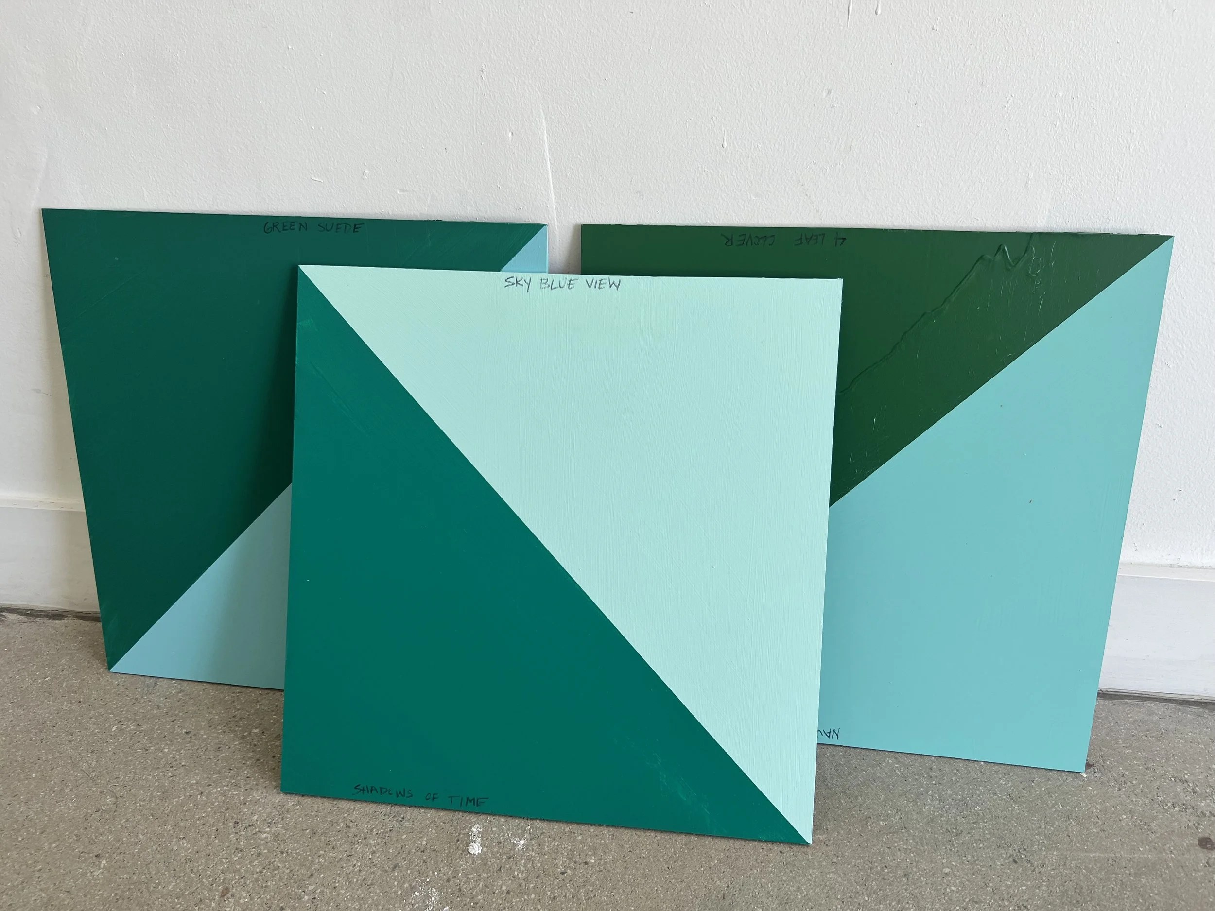
As with any issues with physical print, colors had to be swatched and decided on before applying to the 50 foot space. The producers provided 3 options for various greens that were similar to my initial Pantone callouts. In the end, the forward-most panel was selected for the softer tones.
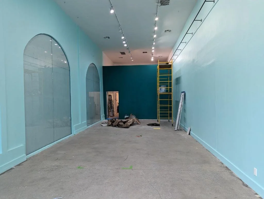
Progress photo of the completed painting of the interior space. Jumping from the bright white made the room feel smaller, which would in turn, provide a more intimate shopping experience.
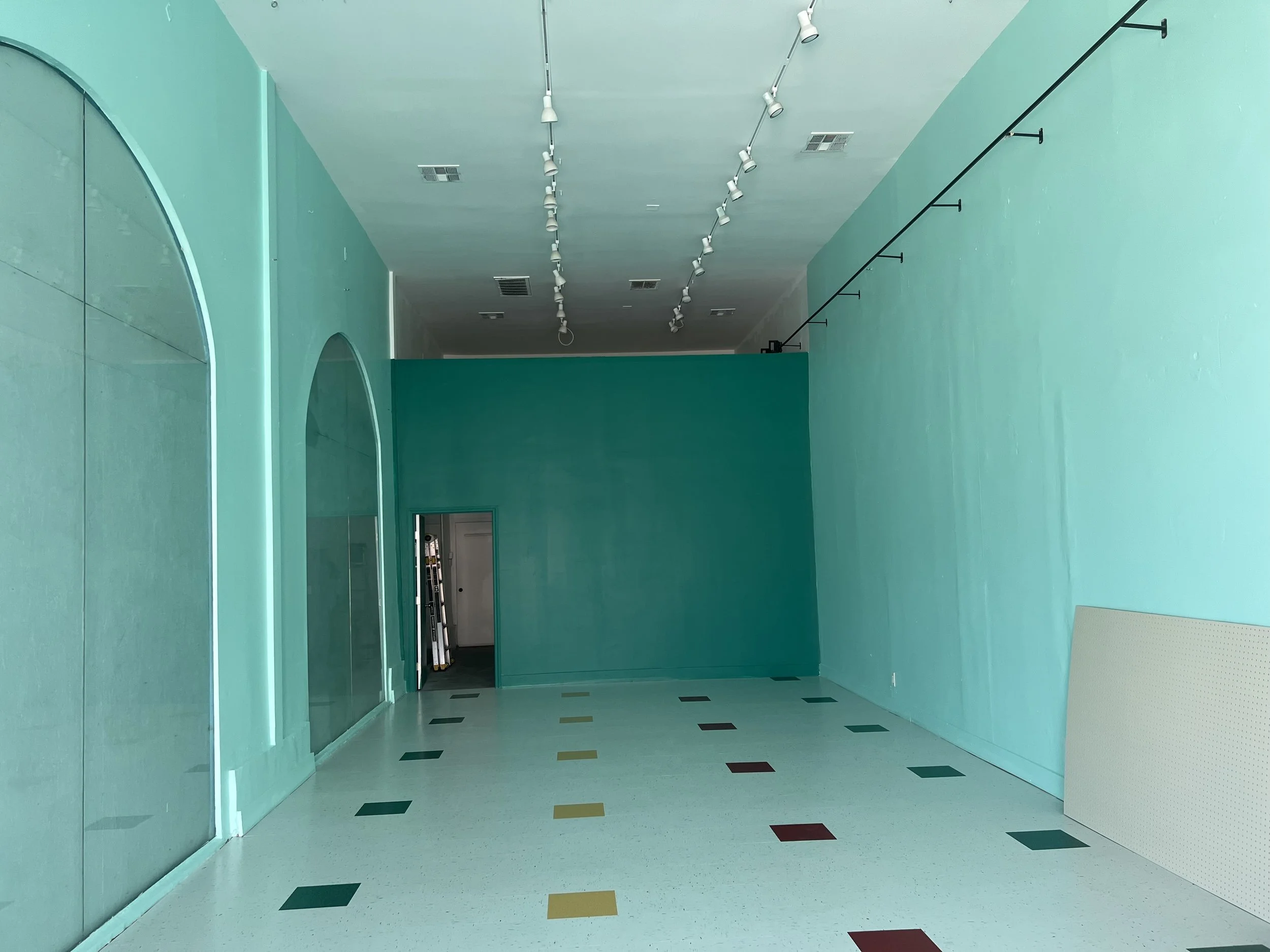
Upon the completion of the interior paint, the flooring vendor was greenlit to proceed and install previously approved tiles. The tiles were laid out to a pattern I designed; a style similar to a typical bodega market.
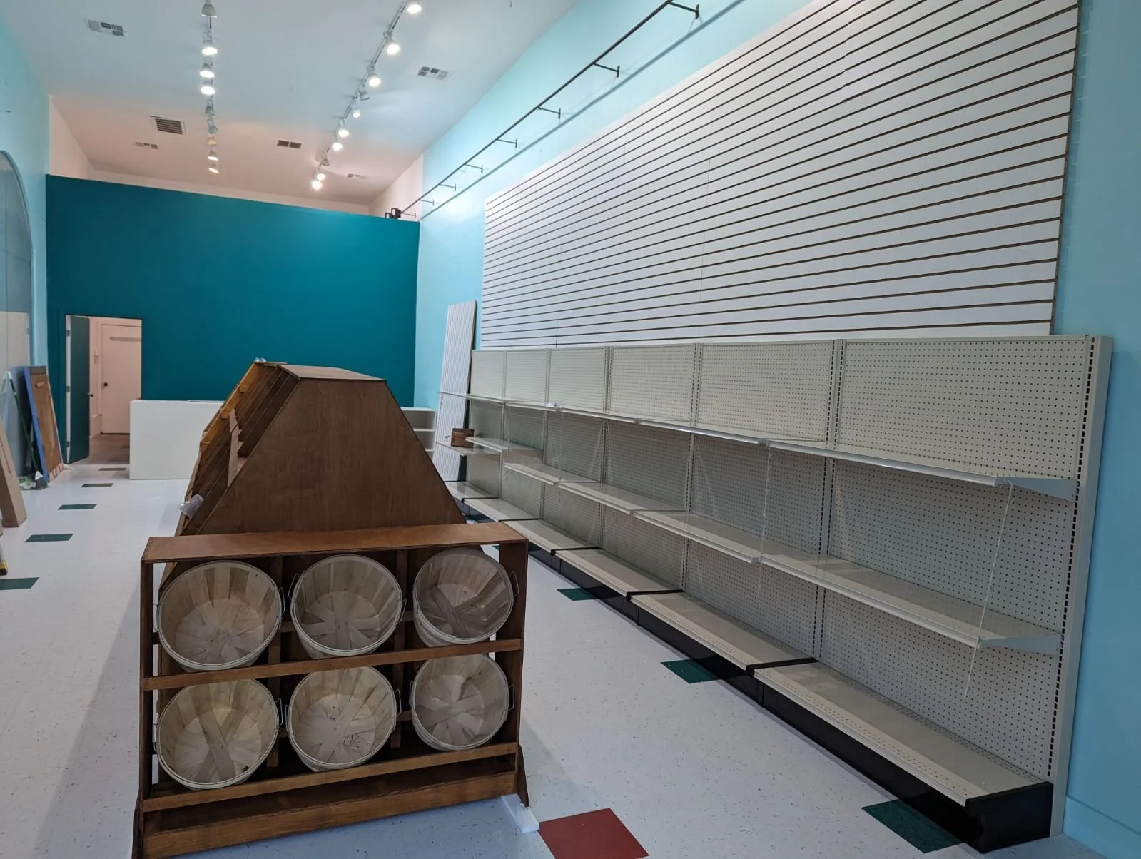
Placements for the set space — bodega shelving and slotted panels accounted for the number of SKUs we projected to display.
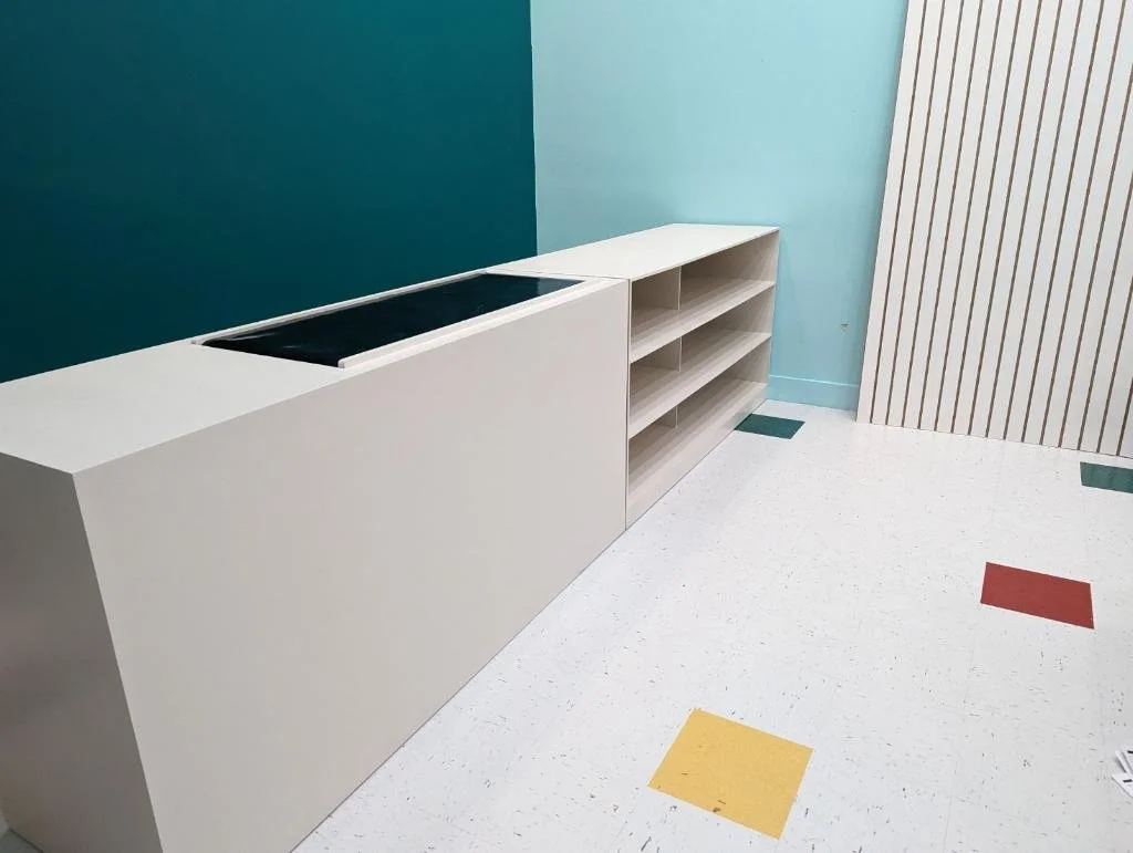
Custom built wooden checkout desks featuring a pseudo conveyor belt for theme, along with shelving for additional merchandise.
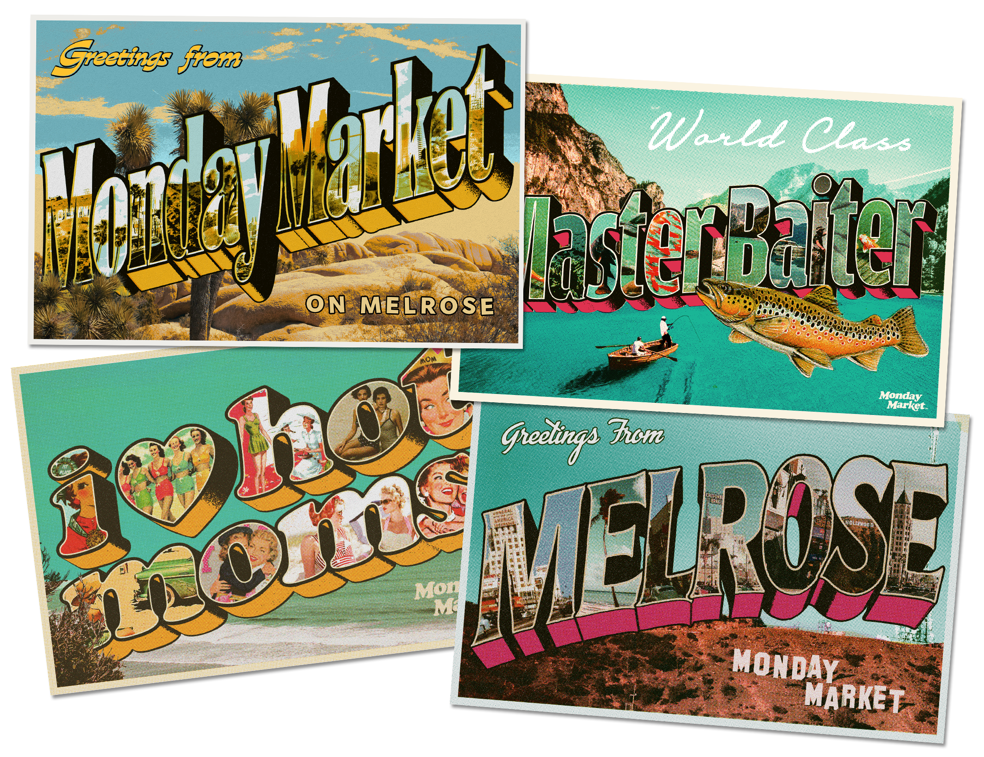
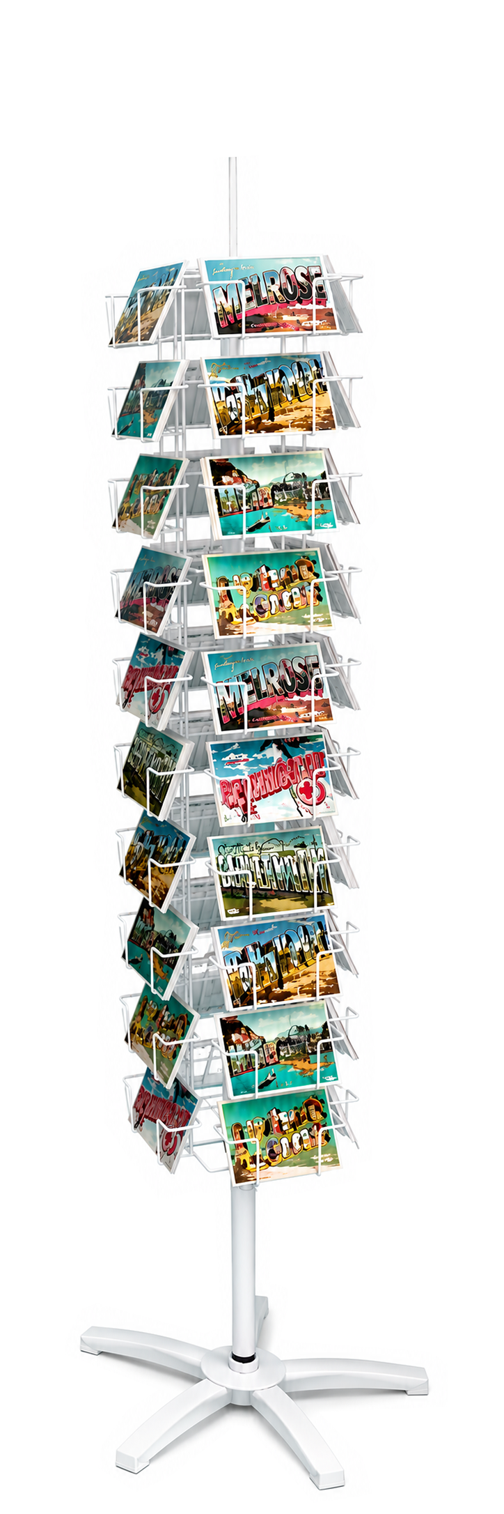
Something I’m excited to highlight was the traditional spinning postcard rack. With the goal of covering every wall and viewpoint as a Point Of Purchase display, I was drawn to making one of these exclusive to the store.
Providing art direction for the exclusive set, I had the idea of turning the most popular apparel staples into funny, and collectible, postcards people could share with their friends and loved ones.

Postcards
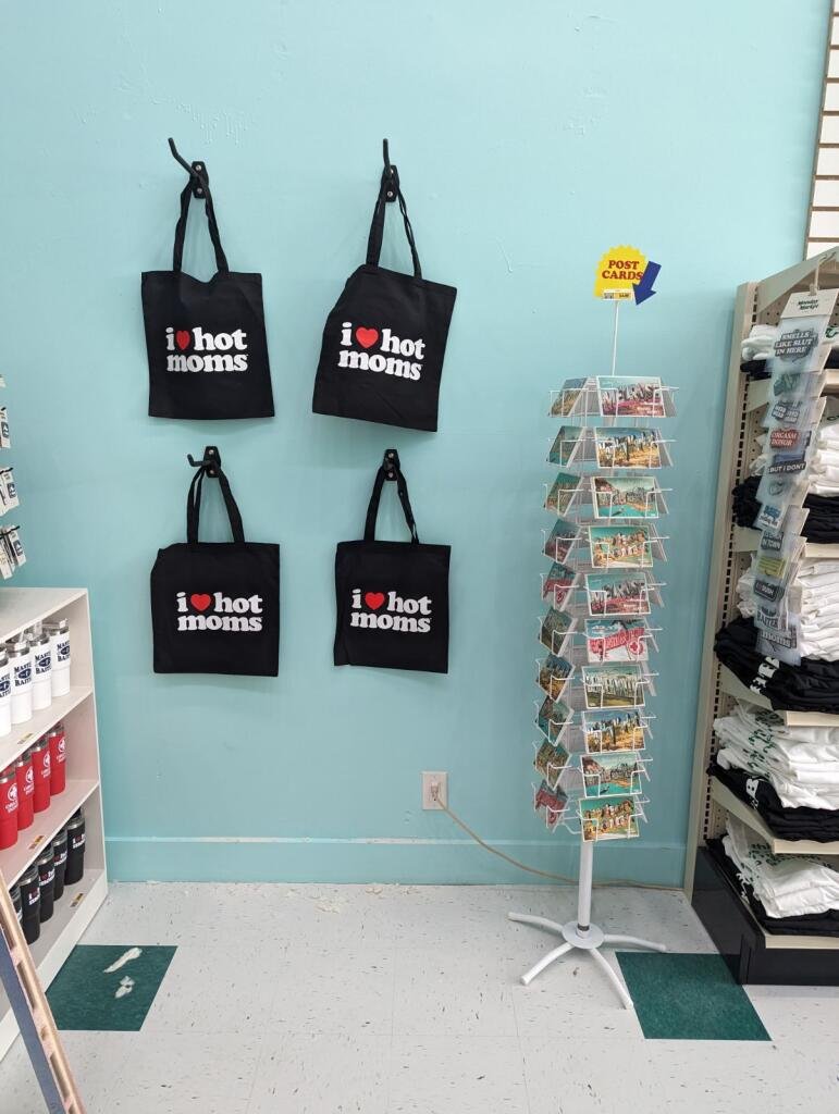
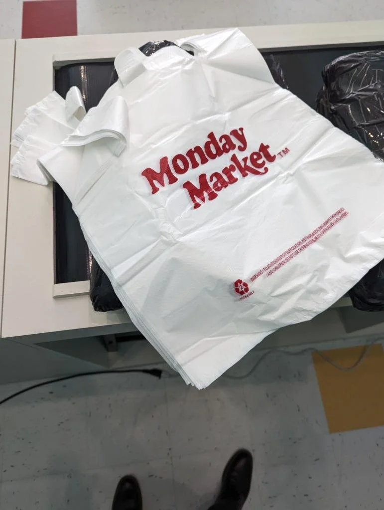
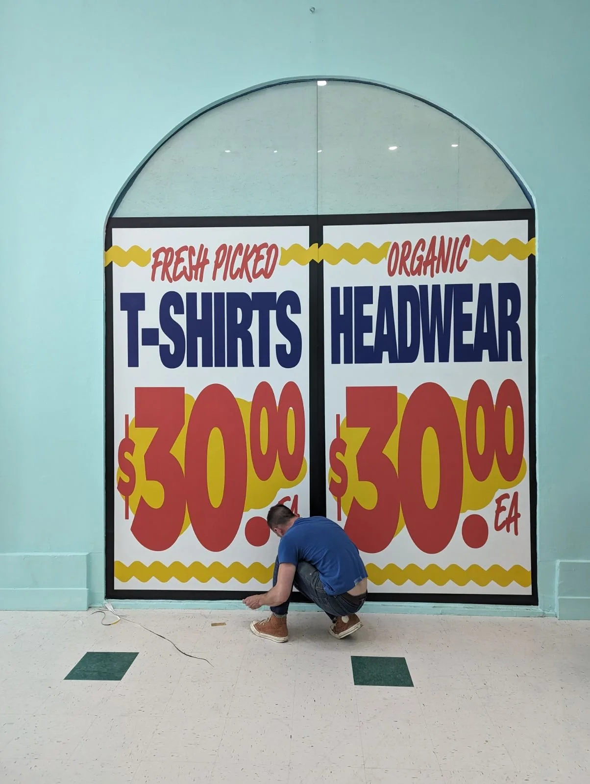
Large format vinyl print graphics made to feel like a vintage market window brought the theme home. Customers also had the option of a branded plastic bag or a collectible statement tote to wrap their purchases.


PREVIOUS
Danny’s Cream Pies — Experiential Design + Retail
NEXT
Live Tour Experience / Visual Design